Social Proof Placement in B2B Product-Led Growth Onboarding
Pair social proof to the specific doubt users face at each onboarding stage.

A friction point isn't just a UX annoyance. It's the moment where a user's internal monologue shifts from "let me try this" to "is this actually worth my time?"
You know the moments. The first required integration. A permission request that looks scarier than it probably is. A blank-slate dashboard that gives you absolutely nothing to work with. A configuration screen that wants answers before it's given you any reason to trust it.
At each of these moments, the user isn't asking a feature question. They're asking a social question: "Did this work for someone like me?" A product tour won't answer that. A tooltip won't answer that. The only thing that answers a social question is social proof, placed at the exact moment the doubt showed up.
The blank-slate problem is worth pausing on because it's the one teams most consistently underestimate. A new user lands on an empty dashboard, stares at it, and has no mental image of what "done" looks like. Without a reference point, the effort ahead feels open-ended — like being handed a map with the destination marked but no roads drawn in. People abandon here before they've hit a single technical block.
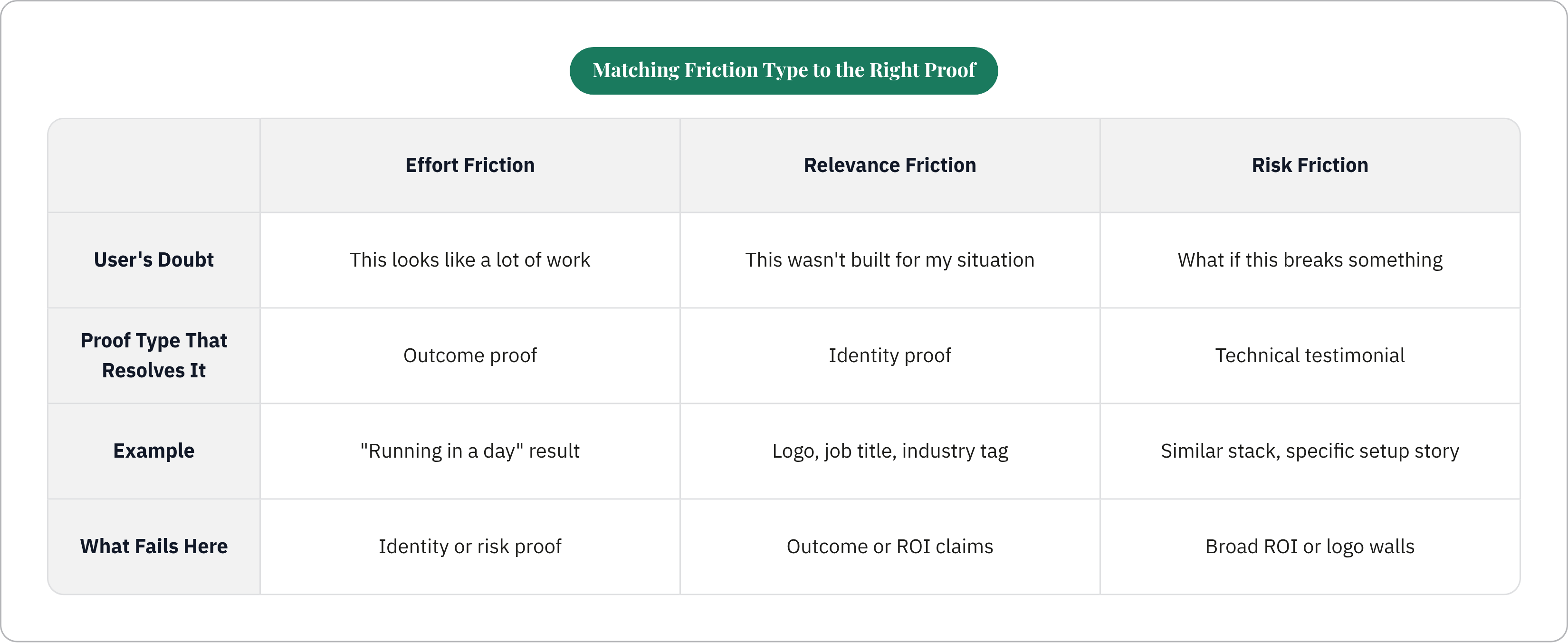
Here's the part most teams miss: friction isn't one thing, and that matters because the right proof for one type is the wrong proof for another.
- Effort friction ("this looks like a lot of work") gets resolved by outcome proof. "Company X had this running in a day."
- Relevance friction ("I'm not sure this was built for my situation") gets resolved by identity proof. A logo, a job title, an industry tag that says "this was made for people like you."
- Risk friction ("what if this breaks something") gets resolved by technical testimonials. Specific ones. From someone who was in the same spot with a similar stack.
Get the mismatch wrong and you're not just wasting the asset. You're adding noise at a moment that desperately needed signal.
The Five Onboarding Moments Where Social Proof Changes Behavior
Timing is everything here. The same testimonial that does nothing on your homepage can stop an abandonment cold if it shows up at the right second.
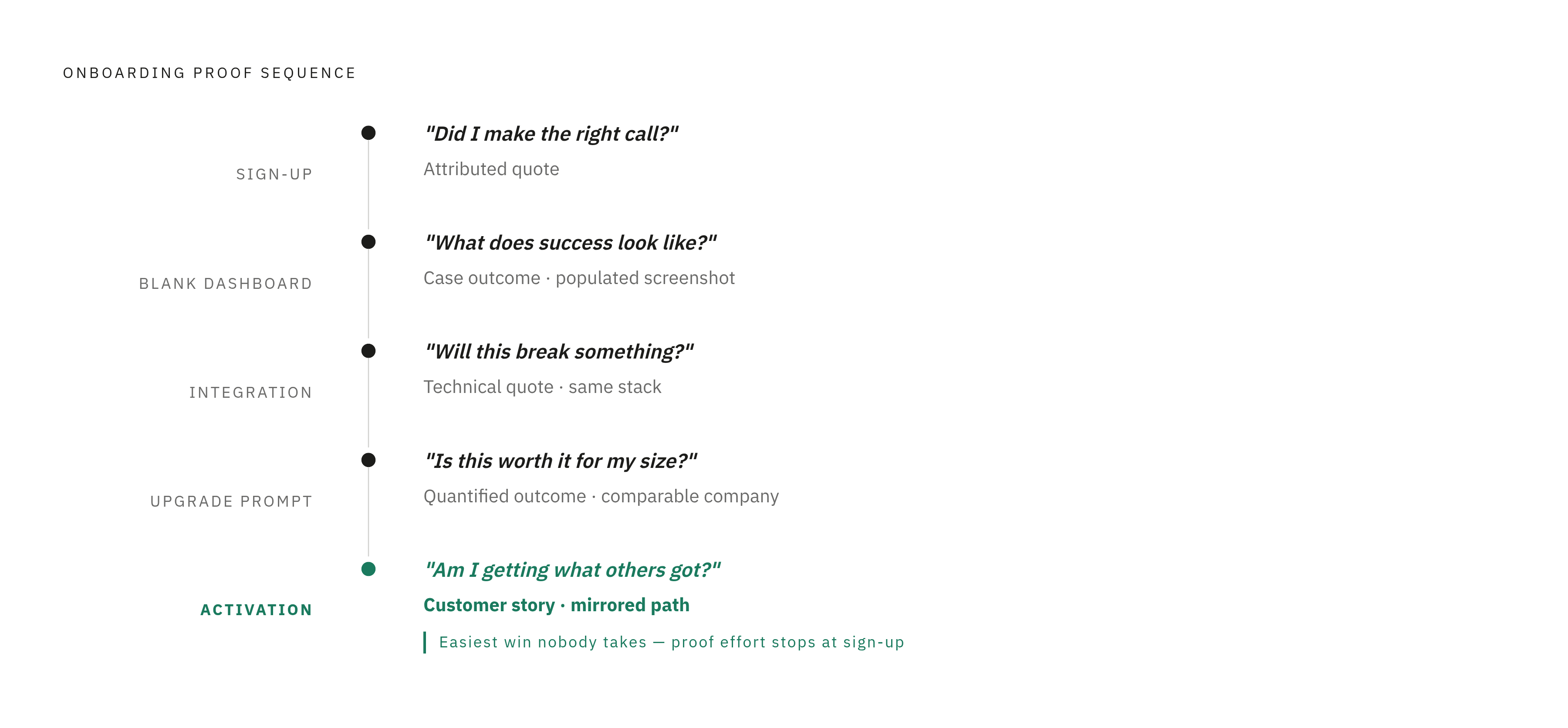
The sign-up and first-access screen. The user's question is "did I make the right call signing up?" A logo wall doesn't answer that. One well-attributed quote from a recognizable peer does. One sentence. Name, title, company. Something that confirms early value and gets out of the way.
The blank-slate or empty-state screen. The user's question is "what does success even look like from here?" Show the destination. A short case outcome works well. "After their first week, Company X had X completed." Or a screenshot of a populated version of the exact dashboard they're staring at. Don't just show the starting line and wish them luck.
The first integration or data-connection step. The user's question is "is this going to take forever or break something?" This is where an ROI claim will actively hurt you. The person doing the integration does not care about revenue outcomes yet. They want a technical quote from someone with a similar stack who says the setup was actually fine. Audience specificity is everything here.
The feature gate or upgrade prompt. The user's question is "is paying for this actually worth it for a company my size?" This is where a quantified outcome from a comparable company earns its keep. Company size and industry need to be visible, not buried in fine print. Proof at the moment of decision outperforms the same proof on a standalone testimonials page by a significant margin.
The activation milestone, the "aha moment." The user's question is "am I doing this right? Am I getting what others got?" A brief customer story that mirrors the path they just completed tells them yes. Most teams completely miss this one because they pour all their proof effort into pre-conversion and forget that post-activation proof is what builds habits and drives expansion. It's the easiest win nobody takes.
Why the Same Proof Asset Fails at the Wrong Moment
Most B2B companies have reviews, testimonials, and case studies. The problem isn't volume. It's positioning.
A CEO-facing ROI quote placed on an integration screen doesn't answer the technical lead's question. It creates noise. The procurement manager, the technical lead, and the end-user evaluating the same product all have different concerns and different stall points, and proof that isn't matched to the right person at the right moment gets ignored even when it's sitting directly in view.
Timing mismatch is just as damaging as audience mismatch. A three-minute video case study at the sign-up screen asks too much before the user has invested anything in the product. That same video at an upgrade decision point, when someone has already experienced real value and is actively weighing commitment, performs completely differently.
Logo walls are probably the clearest illustration of this. Recognized brand names carry some credibility in a passive scan, sure. But they do nothing at a moment of active doubt. "We work with these companies" does not answer "will this work for my team in the next two weeks." It's like someone handing you a list of restaurants other people enjoyed when what you actually asked was whether the kitchen can handle a nut allergy. Different question entirely.
For every proof asset in your onboarding flow, ask which friction type it resolves (effort, relevance, or risk) and whether that friction type is actually present at that screen. If the answer is no, the asset is decoration.
Matching Proof Format to the Onboarding Moment
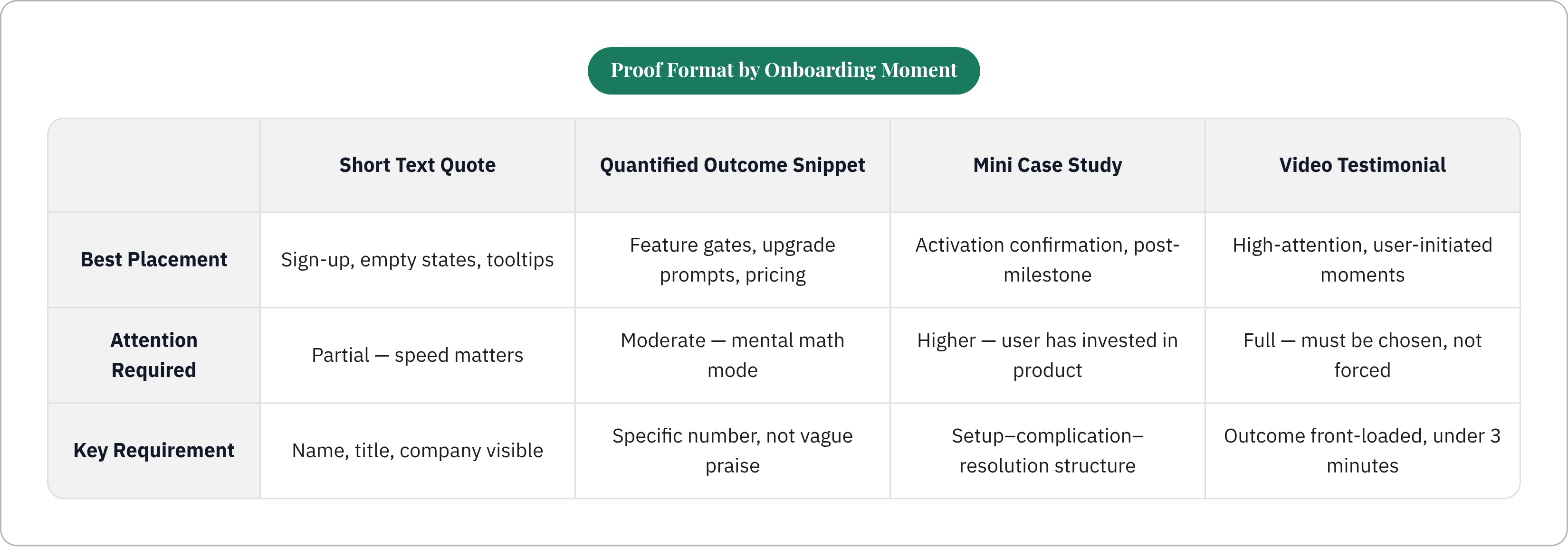
Format should follow the nature of the friction and the user's available attention at that screen. Not all proof fits all moments, and forcing the wrong format is its own kind of friction.
Short text quotes with attribution work best for sign-up screens, empty states, and inline tooltips. Anywhere attention is partial and speed matters. Name, title, and company need to be visible. Ideally company size or industry too. Named testimonials consistently outperform anonymous ones, even when anonymous quotes are verified. Attribution still matters even when the gap is narrow.
Quantified outcome snippets belong at feature gates, upgrade prompts, and pricing screens. Moments where the user is doing mental math about cost versus return. "Reduced setup time by 60%" outperforms "saved us so much time" every time. Specificity is what makes the number feel real rather than like copy someone put there to fill space.
Mini case studies, two to four sentences, work best at activation confirmation and post-milestone screens. The user has now invested something in the product and can relate to a fuller story. Follow the setup-complication-resolution structure even at this small scale. "Company X faced this problem, used this feature, got this specific result." That's enough. Don't oversell it.
Video testimonials only belong at high-attention moments. Video can move conversion, but only when the user chose to engage, not when they're mid-task. Keep it under three minutes and front-load the outcome. If you don't, most people won't stay long enough to get there.
Logo plus context combinations are worth understanding because logos alone are passive. A logo anchored to a single outcome stat becomes actual proof. "[Logo]. Cut implementation time in half." Now the logo has a job instead of just sitting there looking impressive.
How to Audit an Existing Onboarding Flow for Proof Gaps
Start with the drop-off data, not the asset inventory. Where do users exit before completing activation? Those screens are the ones that need attention.
Map each exit point to a friction type: effort, relevance, or risk. That tells you which proof format actually belongs there.
Then walk the flow as a first-time user from your ICP with no prior product knowledge. Note every moment where a question comes up that the UI doesn't answer. Write them down as you go. You won't hold all of them in your head, and the ones you lose are usually the ones that matter.
After that, lay your existing proof assets against the gap map.
- What friction type does each asset address?
- Where in the flow does that friction actually appear?
- Assets that don't map to a real friction point are candidates for repositioning, not deletion.
Then check each proof asset against three basic standards:
- Attribution. Name, title, and company are visible.
- Specificity. A real number or concrete outcome, not a vague positive.
- Relevance. Does the person cited match the ICP of the user who will see it? Industry, company size, role.
After you make placement changes, measure at the screen level. A/B test proof placement against no proof at that specific screen. Track step-completion rate. That's the signal you're looking for.
Why the Proof Assets PLG Onboarding Needs Rarely Exist in the Right Form
Here's the honest problem: most teams' proof libraries were built for the homepage and the pitch deck. Not for the integration screen. Not for the empty-state moment.
Homepage proof tends to be broad, outcome-focused, and written for the economic buyer. Onboarding proof needs to be narrow, moment-specific, and written for the practitioner doing the work. Those are almost opposite requirements. The same asset can't serve both, which is why teams end up with proof libraries that look full and keep failing in the flow anyway.
The biggest bottleneck usually isn't writing. It's getting customers to participate and pulling the right specificity out of the conversation. Generic interview questions produce generic quotes. A structured interview produces usable snippets.
A Before/During/After interview structure works well because it surfaces friction-specific detail. What problem existed. What the setup or switching moment actually looked like. What the concrete result was. It also makes the conversation easier for the customer because they have a clear thread to follow rather than being asked to say something nice about the product.
One customer conversation can produce proof for multiple onboarding moments if you structure the questions to go there. An implementation quote, a blank-state confidence quote, and an ROI quote can all come from a single conversation if you ask for each one. The specificity is already in the customer's head. The interview just has to go find it.
And here's something the industry has learned the hard way: buyers distrust testimonials that have been polished until they sound like ad copy. Real language, honestly describing the setup effort, with a specific number attached, outperforms a smoothed-over version of the same story. When a quote sounds too clean, it reads as fabricated even when it isn't. Aggressive editing of customer quotes is a liability disguised as quality control.
Regulated industries face an additional layer. Named proof is sometimes legally off the table. Blind-but-verified testimonials, where company size, industry, and role are visible but the name isn't, are a legitimate path. Most regulated-industry buyers will accept that tradeoff, and the trust gap between named and unnamed is narrower than most marketers assume.
Building a System That Keeps Onboarding Proof Current and Matched to Friction
Social proof in onboarding has a shelf life. Customers churn. Products change. ICPs shift. Proof placed today needs to be maintained, or it becomes irrelevant or actively misleading.
The production cadence should be tied to product changes, not the marketing calendar. When a new integration ships, the integration screen needs proof that reflects the current experience. Not a testimonial from two years ago about a workflow that no longer exists in that form.
The teams that get this right share a few habits.
They tag proof assets by friction type and placement moment, not just by customer name or industry. When you can filter your proof library by "effort friction, integration screen, technical role," you can fill gaps quickly instead of hunting through a folder of PDFs for something that might work.
They build a lightweight refresh trigger into the product roadmap process. Any feature change that touches the onboarding flow flags which proof assets are now stale. That's a five-minute conversation in the right sprint planning meeting, not a quarterly audit that gets scheduled and rescheduled twice and then quietly abandoned.
They keep a short list of customers willing to be re-interviewed. Products change, and customers' experiences change with them. A customer who gave you a great implementation quote 18 months ago now has a much better story about what the product does at scale. The second conversation is usually faster and richer because they already know what you're looking for.
Most importantly, they treat onboarding proof as a product surface, not a marketing deliverable. There's a clear owner. Someone who reviews proof assets when the product changes, tracks step-completion rates at proof-bearing screens, and can request a new customer interview the same way they'd request a copy change.
Without ownership, proof drifts. And drifting proof is just decoration with extra steps.