Internal Linking Architecture for B2B Content Sites
Smart internal linking turns discovery traffic into qualified leads before sales ever engages.
6sense's Buyer Experience Report finds that B2B buyers finish about 60% of their purchase journey before they ever talk to a vendor. Vendors get roughly 17% of the total journey in direct contact. Either way you slice it, the website is doing the sales team's job long before the sales team shows up. Most B2B content programs pile up traffic without turning it into pipeline, and the reason is almost always the same: discovery content and deal-relevant proof sit on the same domain, but nothing connects them.
That's an internal linking problem, not a content quality problem, and treating it like the latter is where most teams waste a year. A blog post can rank on page one for the exact phrase a buyer typed into a search engine, get read start to finish, and still lead nowhere, because the only link on the page points to another blog post about a vaguely related topic. Somewhere on that same domain sits a case study that answers the buyer's actual next question. Nothing links to it. So the buyer leaves, and the content investment leaks out the bottom of the funnel, quietly, every single day.
Pillar-cluster architecture and topical authority
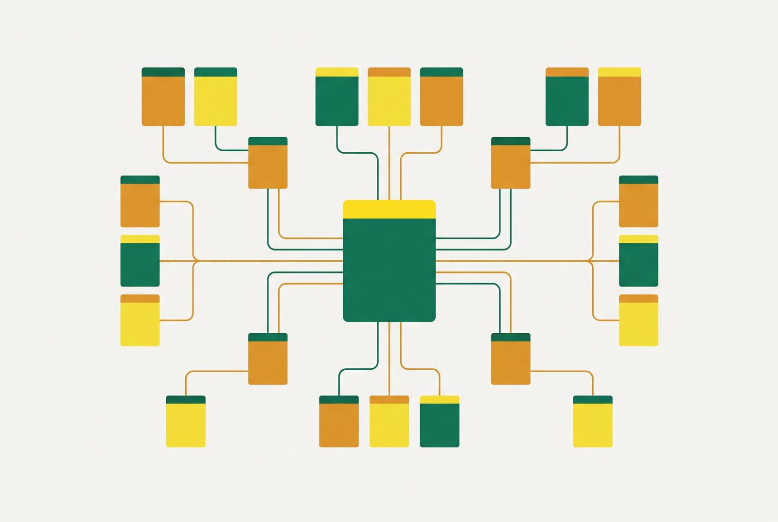
The pillar-cluster model isn't new, but many sites claim to run it while only building half of it. What's new is how many sites claim to run it while only building half of it. One pillar page covers a topic in full, usually 3,000 to 10,000 words, comprehensive enough to stand alone as a reference. Somewhere between 5 and 20 cluster pages branch off it, each going deep on a narrower slice. Every cluster links back up to the pillar. The pillar links out to every cluster. Cluster pages cross-link to two or three siblings that are actually relevant.
Three working layers make this buildable instead of theoretical.
Hubs are the pillars: big, definitional pages that map a topic and tell readers and search engines what subtopics live inside it. Spokes are the cluster pages, the deep dives and use cases and question-and-answer pages, each linking back to its hub and sideways to a sibling where that actually makes sense contextually, not because a plugin suggested it. Bridges are the connective tissue: comparison pages, frameworks, case studies, anything spanning two clusters instead of living inside one. Bridges keep clusters from calcifying into silos, which happens more often than most content teams want to admit.
A JetOctopus case study on a large site found Googlebot's crawl coverage jump from 40% to 70% after the internal linking structure got rebuilt. That's what separates a search engine seeing most of a site from seeing less than half of it. Pages that don't get crawled don't get ranked, no matter how well they're written. Log file analysis on large sites suggests fewer than half of all pages get enough internal links to be reliably found by crawlers. Orphan pages don't get a fair shot. They sit there, technically published, functionally invisible, like a store with no door.
The structural gap most B2B sites have, and how to find it
Audit work across 35 B2B sites in 2025 and into 2026 turned up a consistent number: the median gap between a domain's best-linked page and its worst-linked page was 147 internal inbound links. Not a typo. That's a gap on the same domain, under the same brand, and the pages sitting at the bottom of it were, with remarkable consistency, the worst organic performers on the site, regardless of writing quality or backlink profile.
That's the real finding, and it cuts against how most teams diagnose underperformance. Nobody needs better writers. Huge chunks of good content are invisible by design, because nothing on the site bothers to point at it.
Most of this traces back to one habit that's close to universal in B2B: navigation gets built around the org chart, not around how a buyer actually thinks. Menu items like "Platform," "Solutions," and "Services" map to how leadership divided up departments and job titles. They don't map to what a buyer types into a search bar at 11pm while trying to solve a real problem.
A VP of Supply Chain searches "supplier risk." She lands on a page called "Intelligent Automation Module." That module might address supplier risk somewhere buried in its feature list, but she has no way to know that, because the page title and every link pointing at it were written in the vendor's internal dialect, not hers. She bounces. Sales never finds out she existed.
Anchor text as a buyer-intent signal, not just an SEO variable
Anchor text gets treated as a technical checkbox, something to sprinkle a keyword into and move past. That undersells what it actually does. Good anchor text does one job that reads two ways: it tells a human what's waiting on the other side of the click, and it tells a search engine what that destination page covers. Get those two signals to agree and both readers and crawlers act on it. If they disagree, the reader clicks "learn more" into a page that doesn't match what they expected, while the crawler gets a signal too vague to use.
Zyppy's analysis of 23 million internal links found that pages with at least one exact-match anchor pointing at them got roughly 5 times the traffic of pages without one. That's correlation, not proof the anchor caused the traffic, but a gap that size is not noise. That gap is worth building process around.
A few rules hold up in practice. Write anchors that name the destination specifically: "enterprise CRM integration guide" beats "click here" or "learn more" because it tells the reader what they're about to get before they get it. Mix exact-match phrasing with partial matches and related language, so the link profile reads like something a person wrote rather than something optimized within an inch of its life. Use brand and product names as anchors only when they genuinely describe what's on the other side, never as a keyword-stuffing move. Match the anchor to where the reader actually stands in their thinking, so a link into a pricing page or a demo request sounds like a decision, not a vague nudge to "explore more."
Placement carries just as much weight as wording. Links near the top of a page's main body pass more attention and more internal authority than anything buried in a footer or shoved into a sidebar nobody scrolls to. Drop the "next step" link right after a problem gets explained, right after a mini example lands, right after a data point makes the reader go "huh." That's the exact second interest peaks. The reader's attention moves on before the link appears, because the delay itself causes the drop in interest.
Building the buyer-journey layer: routing discovery content toward deal-relevant proof
Ask this about any B2B content site: does the highest-traffic blog post link to the product page it's actually relevant to? Does the pricing page link out to customer stories a price-sensitive buyer would want before signing anything? If the honest answer is "not really," that gap is costing pipeline right now, today, quietly.
Full-funnel mapping is simple in theory. It's rarely done well in practice, mostly because nobody owns the connections between stages.
Top of funnel content, the problem-aware blog posts and original research, pulls in organic traffic but carries almost no buying intent by itself. Middle of funnel content, the use case pages, the comparisons, the frameworks, is where a buyer starts genuinely evaluating fit, and it's the bridge layer earning its keep. Bottom of funnel content, case studies, pricing pages, demo request pages, is where specific proof closes the distance between interested and ready to buy.
Case studies sit right at the bridge point. A case study about cutting manual ops work connects naturally in two directions: back to the operational efficiency pillar content that brought the reader in, and forward to the product page that solves their actual problem. Most sites skip that second connection entirely, which is the more expensive miss.
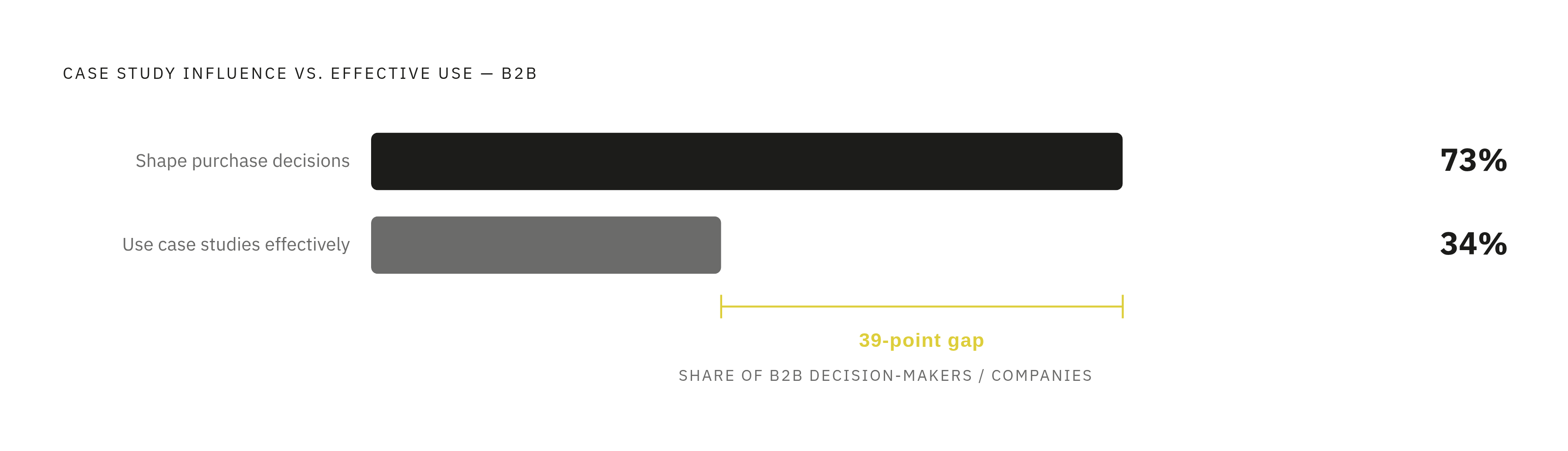
Case studies are widely considered the single most persuasive format at the decision stage, with 73% of B2B decision-makers saying they significantly shape the purchase process. Only 34% of companies say they use case studies effectively. A 39-point gap between how much a format matters and how well anyone deploys it is a structural problem. It's a structural one: the case studies exist, but they're just sitting off to the side, disconnected from anything that could send a reader toward them.
Case studies as internal linking destinations
Most case studies read like project reports written for an internal file, not for a stranger deciding whether to trust a vendor with real money. They describe what the provider did. They rarely describe what changed for the customer, in the customer's own words. Nobody links to them from top-of-funnel content, because there's no thread connecting a problem-aware reader's question to a story sitting three clicks away.
The fix is structural: problem, solution, result, written in the customer's language, not the vendor's.
Problem covers what the client dealt with before any of this started, phrased the way that customer would actually say it out loud. That phrasing is what lets a blog post match language naturally and link over without friction. Solution explains how the product addressed that specific situation, specific being the word doing the heavy lifting. Result reports measurable outcomes: real numbers, named metrics, cost or revenue figures somebody could check if they wanted to.
That last part is where decoration and proof split apart. "A leading enterprise reduced costs by 40%" is a claim anyone could type. Attach a name, a title, a company, and a sign-off on that number, and it turns into something a skeptical buyer can verify. A name versus no name is most of the distance between a case study people believe and one they skim past on the way to a competitor's site.
HubSpot's case study pages show the structural version of this done right: three commercial outcomes sit directly below the hero image, immediately visible on landing. A steep pricing increase, aimed at leadership. A 50% drop in customer acquisition cost, aimed at marketing. Up to $300,000 in annual staffing savings, aimed at operations. Three numbers, three different people on a buying committee, each one hitting the figure that matters to their job within five seconds of landing on the page.
Social proof placement as a systematic linking decision, not a design afterthought
67% of B2B buyers say they've ruled out a vendor because the evidence on offer felt untrustworthy. That number reveals a gap driven by the absence of any system for collecting proof, verifying it, and getting it in front of a buyer at the exact moment sales needs it there, and it should reframe how proof gets handled on most sites. It's the absence of any system for collecting it, verifying it, and getting it in front of a buyer at the exact moment sales needs it there. A homepage testimonial slider and a couple of review badges don't add up to a system. They add up to wallpaper.
Customer proof does four distinct jobs, and treating them as one bucket produces most weak proof strategies.
Evidence covers verified quotes, ROI numbers, and outcome data, ideally organized by industry, company size, use case, even competitor, and it is most directly usable as an internal link target from any relevant blog post. References are the direct peer-to-peer conversations that close out late-stage deals, the kind no web page replaces. Advocacy is the ongoing community engagement that keeps existing customers willing to keep talking about the product without being asked. Reviews sit on third-party sites buyers already trust and already visit on their own, independent of anything the vendor built.
Each function needs a different home and a different linking strategy. Evidence belongs woven directly into content, close to the moment a reader is deciding whether to believe a claim. References get surfaced late in the funnel through sales conversations, not organic search. Advocacy runs mostly off-site, in community spaces a vendor doesn't fully control. Reviews live where they already live, and the best move for a site is linking out to them credibly rather than trying to rebuild that trust internally.
Lumping all four into one undifferentiated "proof" category is how sites end up with a scattered testimonial page and not much else. The fix is putting the right kind of proof in the right place, not generating more proof. It's putting the right kind of proof at the specific spot where a specific buyer is standing, at the moment they're deciding whether to believe what they just read.